Around the Colour Wheel in Eighty Shades: Part Two


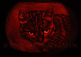
I love this colour combination, as you get the warmest orange to bring the focal point of the image forward and the cool blue to push the rest into the background.
As the blues in this part of the colour wheel are quite granulated, I find they are not so good for small detail, but they are easy to lift away if you make a mistake.

I glue sample-circles of my watercolour collection onto magnets and stick them to a white board over colour strips. Where two colours are complementary, when you mix them, the colour will turn a neutral colour, and these strips help me identify the complementary colours.
When I am planning a painting, I move the magnets around and look at the colour strips on my colour board.
When I set out on my mission to categorise all my paints, I hoped to definitively create a list of where each paint fell on the colour wheel. With this section, because of the granulation of the blues, and with the creaminess of some of the oranges, I found I could not make up my mind which paints best matched the other paints, so in the end, I left it a bit fluid.
Here's a list of the colours that fit on my paint strips for this section. Mostly I use Daniel Smith Ultramarine Blue and Permanent Orange, but there are many other options.
Oranges:
Permanent Orange (Daniel Smith)
Winsor Orange (Winsor and Newton)
Cadmium Orange (Winsor and Newton)
Shades in the middle:
Gold Ochre (Winsor and Newton)
Brown Ochre (Winsor and Newton)
Burnt Sienna (Winsor and Newton)
Magnesium Brown (Winsor and Newton)
Burnt Umber (Winsor and Newton)
Duochrome Desert Bronze (Daniel Smith)
Tigers Eye (Daniel Smith)
Vandyke Brown (Winsor and Newton)
Blue Apatite (Daniel Smith) - a bit green for the overall section, but it fits when Ultramarine Green Shade (Winsor and Newton) is Mixed with Permanent Orange (Daniel Smith) and is a gorgeous paint to work with.
Blues:
Ultramarine Green Shade (Winsor and Newton)
French Ultramarine (Winsor and Newton)
Cobalt Blue Deep (Winsor and Newton)
Ultramarine Blue (Daniel Smith)
I always think this colour scheme will work fantastically with Winsor and Newton Gold Ink, but as yet, I have never dared splash it on a finished painting. I hope one day I will be brave enough.
Happy creating! And if you do create anything using these colour combinations, please tag me on social media so I can see your fantastic art.
@motiblackart
on facebook, twitter, and instagram.
See my art portfolio on my RedBubble Shop!

Comments
Post a Comment